Newcastle United's boldest move yet?
Newcastle United's iconic club crest is set for a redesign for the "digital world" – but some fans are yet to be convinced of the need for change.
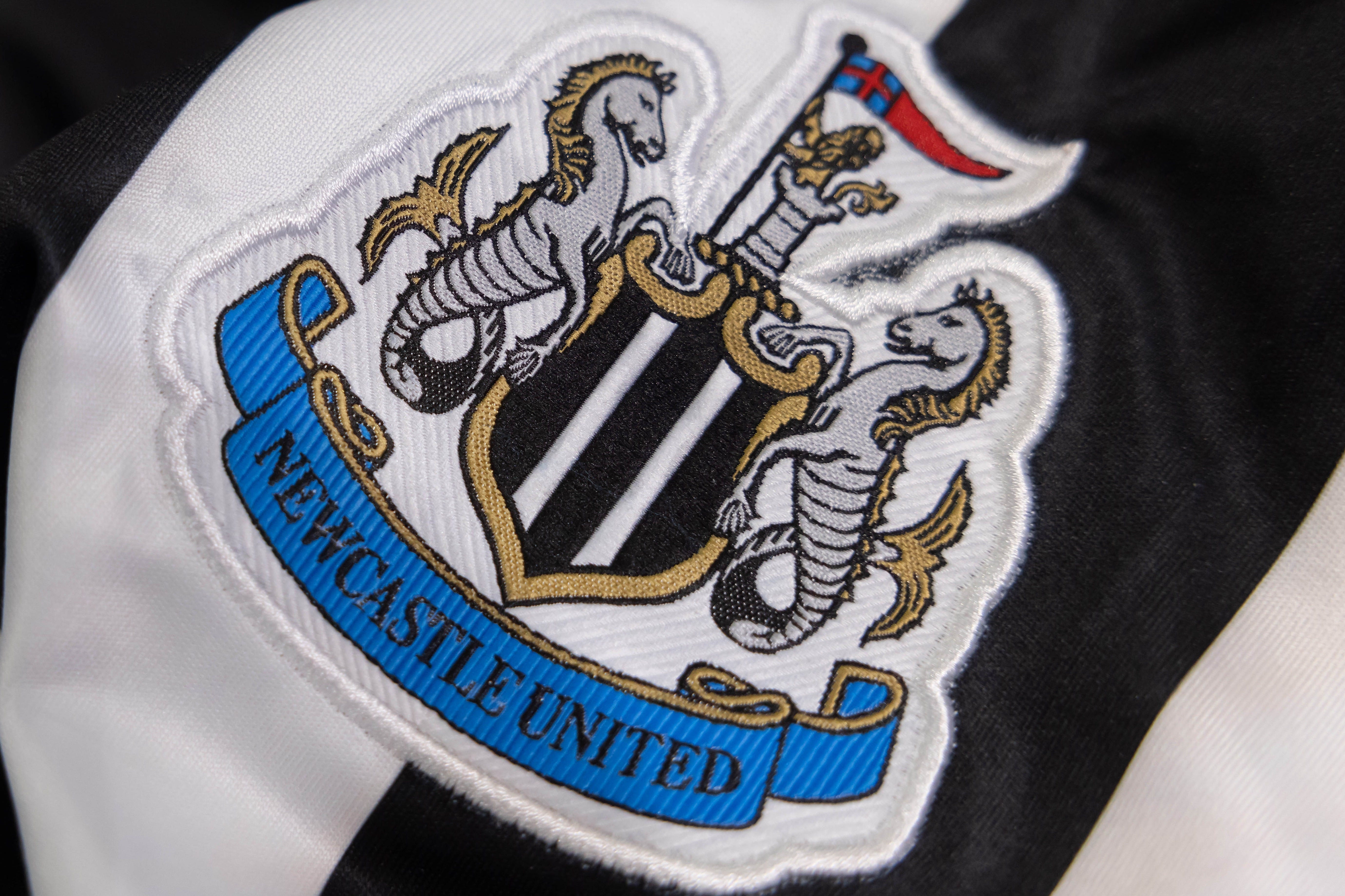
Why change the best club crest in the Premier League?
That is the question many Newcastle fans have been asking since the club revealed its intention to “refine and revive” its iconic crest earlier this month.
The badge, which takes elements of the city’s own crest, has served the club well, through good times and bad, for almost four decades.
It has been one consistent through a turbulent few decades at St James’ Park.
So, not surprisingly, there is some resistance to ANY change to the crest.
Yet there has been an inevitability about a redesign given that most other Premier League clubs have already updated or changed their crests for the “digital world”. Newcastle are one of the few top-flight clubs not to have made any change to their crest over the past couple of decades.
The club, looking to build its brand around the world, pointed out the crest’s “intricate design” as a factor in their thinking.
“This isn’t a decision we take lightly. We love our crest. It’s iconic and has stood us through unforgettable triumphs and testing times. But it was created in a different era. Its intricate design doesn’t always translate well in today’s digital world. And it’s difficult to reproduce it clearly and consistently.
“As football and the world changes, so too must the symbol that unites us.”
Change, clearly, is seemingly coming, whether some fans like it or not.
The brand-conscious club, significantly, said that changes to the design would be “minimal”, while fans at a workshop were told that the new crest would not be circular, like two of it’s old badges.
What is important is that the fan consultation is meaningful, and not just a box-ticking exercise.
Newcastle United Supporters Trust (NUST) wrote to Darren Eales, United’s chief executive officer, to argue that the club’s survey did not satisfy Football Association rule M9, which states: “A club must be in a position to evidence that the majority of its supporters are in favour of a material change to its club crest prior to making any such change.”
NUST’s response read: “As it stands, the survey is not able to provide information on whether the majority of our supporters are open to the idea of making a material change.”
The organisation called on the club to “provide a new survey, written in a neutral tone and to include an option for supporters to indicate that they do not wish to pursue any change at all”.
There is a big difference between a fanbase’s understanding of the need for change – and that same fanbase’s support for a particular change.
It feels rushed to some fans, while others questioned the timing of the initial email, which came a couple of days before a hugely-important Premier League home game against Chelsea.
There will not be a change to the badge for next season, but a decision will need to be made soon if there is to be a new or updated crest for the 2026/27 campaign.
The process is being led by boyhood fan Dan Ginger, Newcastle’s director of brand, marketing and digital media, and debate around the proposed crest change is symbolic of one of the bigger challenges facing the ambitious club going forward – how can it grow commercially around the world while not straying too far from its roots?
The Leeds United lesson
Communication is all-important on this sensitive issue, and the club, which has got so much right on the pitch since the 2021 takeover, must listen to fans off the field – and learn from experiences elsewhere, such as Leeds United’s disastrous rebrand in 2018 ahead of the club’s centenary.
Leeds said the design was the result of a six-month consultation with 10,000 people. However, the proposed new crest, featuring a “Leeds salute”, was quickly dropped after a backlash from fans.
Leeds, clearly, got that consultation wrong. Newcastle must get their own process right.
Other clubs have given their crests more subtle makeovers, and this is the option favoured by Newcastle.
However, a leaked image of a redesigned crest did not go down well with fans. This mock-up, however, was not a final design.
The club already uses a black and white version of the crest around the stadium, and on its digital platforms, and a subtly-updated badge could satisfy both the demands of both the fanbase and the digital era.
Supporters were asked how important the various elements of the crest – including the castle and seahorses – were to them in an online survey in the first stage of the consultation process.
A number of supporters have posted their own ideas for new or updated crests online, while Ashley Willerton, a sign writer and lettering artist, reposted an updated design he did in 2022.
Newcastle’s Fan Advisory Board have “recommended that the wider fan base should be given a choice of options to select from during the second stage consultation”, according to the club.
In its email to fans, the club used the tagline: “Updating our Crest. Together.”
And fans MUST trust the process.